The ongoing monkeypox outbreak in many countries outside of the endemic regions in Africa has drawn significant attention over the past months. Government agencies as well as academic and industry teams have released open-access databases to track case numbers over time across different countries and visualizations have been made available to help identify and interpret trends. This sharing of real-time data can help support response efforts by offering insight into the dynamics of this outbreak.
I will talk about some of the currently available monkeypox case databases, with a focus on high-quality resources that are frequently updated and easily imported and processed in R. I will show a few examples of how this information can be mapped and visualized. Overall this article aims to help you get started with your own exploration of the available raw data.
We will use a few R packages to construct choropleth maps:
library(ggplot2)
library(dplyr)
library(maps)
library(viridis)
At the time of writing this article, one of the most comprehensive monkeypox case databases is accessible via the Global.health Monkeypox repository. This resource is updated in near real-time by a team of curators that aggregate data from verified sources including governments, public health organisations and health official statements. You can find more details on their methodology here.
We can load the latest worldwide case data into R directly from the Global.health GitHub repository:
# Read worldwide case data
case_series <- read.csv("https://raw.githubusercontent.com/globaldothealth/monkeypox/main/timeseries-country-confirmed.csv")
head(case_series)
## Date Cases Cumulative_cases Country
## 1 2022-07-25 1 1 Andorra
## 2 2022-07-26 2 3 Andorra
## 3 2022-07-27 0 3 Andorra
## 4 2022-07-28 0 3 Andorra
## 5 2022-07-29 0 3 Andorra
## 6 2022-05-27 2 2 ArgentinaEach row records the number of cases and cumulative cases for a country at a given date. We also extract data from the maps package for plotting with ggplot2:
world_map <- map_data("world")
head(world_map)
## long lat group order region subregion
## 1 -69.89912 12.45200 1 1 Aruba <NA>
## 2 -69.89571 12.42300 1 2 Aruba <NA>
## 3 -69.94219 12.43853 1 3 Aruba <NA>
## 4 -70.00415 12.50049 1 4 Aruba <NA>
## 5 -70.06612 12.54697 1 5 Aruba <NA>
## 6 -70.05088 12.59707 1 6 Aruba <NA>This table includes latitude and longitude values for the countries that will be represented in our plots. All the information needed to draw geographic maps of case numbers is now ready. Let’s define a function with the following characteristics:
- Inputs: date, latitude range, longitude range
- Output: map of cumulative case counts on the date provided, bounded by the requested latitude and longitude values
plot_case_map <- function(date, xlim, ylim) {
  # Pre-process case and map data
  case_map <- case_series[which(case_series$Date == date), c(4, 3)]
  colnames(case_map)[1] <- "region"
  case_map$region[which(case_map$region == "United States")] <- "USA"
  case_map$region[which(case_map$region == "United Kingdom")] <- "UK"
  case_map$region[which(case_map$region == "Democratic Republic Of The Congo")] <- "Democratic Republic of the Congo"
  case_map$region[which(case_map$region == "Bosnia And Herzegovina")] <- "Bosnia and Herzegovina"
  if ("Gibraltar" %in% case_map$region) {
    case_map <- case_map[-which(case_map$region == "Gibraltar"), ]
  }
  if (length(setdiff(world_map$region, case_map$region)) > 0) {
    case_map_other <- as.data.frame(cbind(setdiff(world_map$region, case_map$region), NA))
    colnames(case_map_other) <- c("region", "Cumulative_cases")
    case_map <- rbind(case_map, case_map_other)
  }
  case_map$Cumulative_cases <- as.numeric(case_map$Cumulative_cases)
  case_map <- left_join(case_map, world_map, by = "region")

  # Plot case map
  ggplot(case_map, aes(long, lat, group = group)) +
    geom_polygon(aes(fill = Cumulative_cases), color = "white", size = 0.2) +
    scale_fill_viridis_c() +
    theme_linedraw() +
    theme(legend.position = "right") +
    labs(fill = "Cumulative cases") +
    theme(legend.direction = "vertical") +
    coord_map(xlim = xlim, ylim = ylim)
}
We can now plot choropleth maps representing cumulative monkeypox case numbers for given dates and geographic regions:
# Plot world case map as of July 29th 2022:
plot_case_map("2022-07-29", c(-180, 180), c(-55, 90))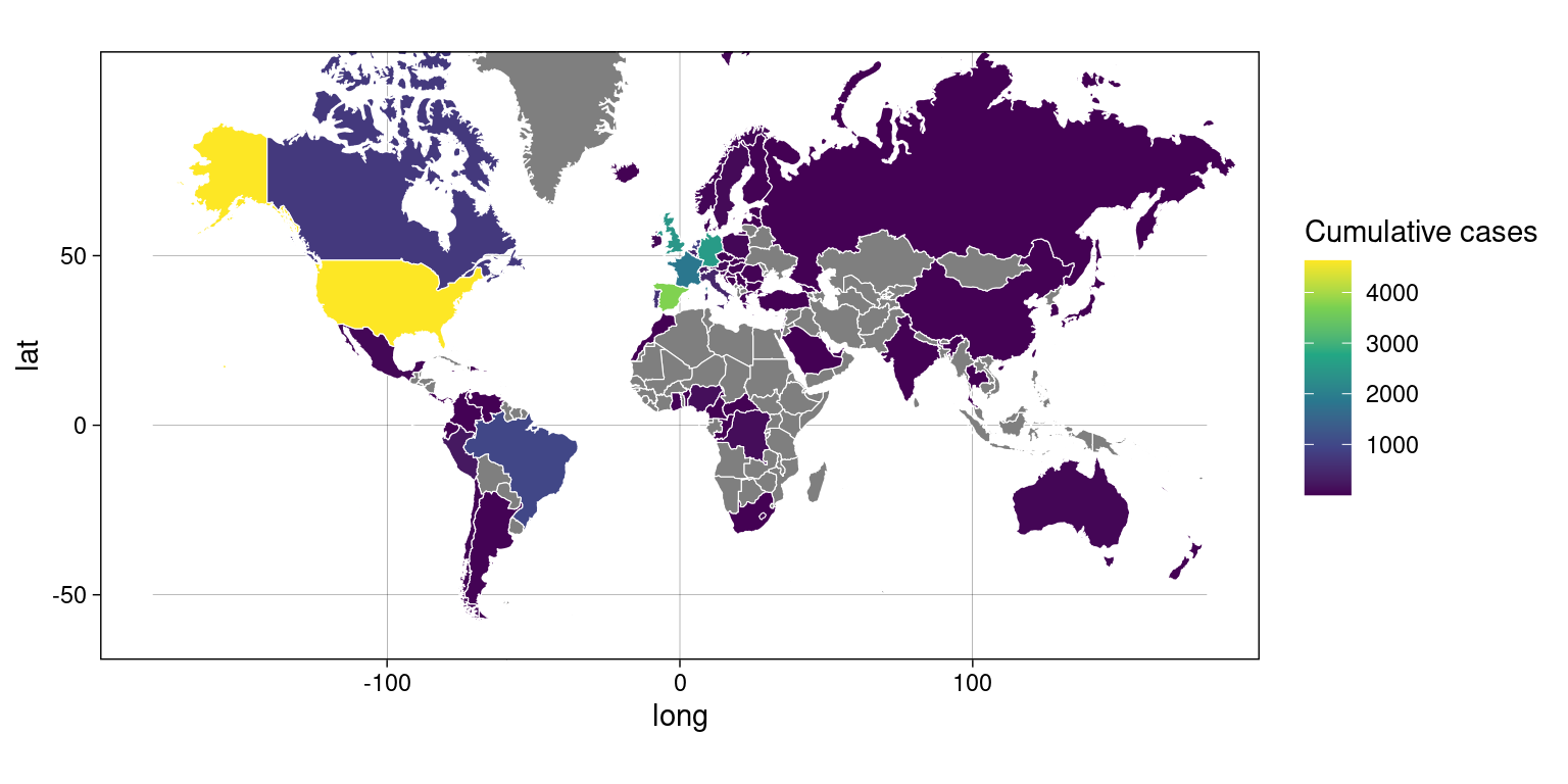
Figure 1: World case map on July 29th 2022
# Plot world case map as of May 29th 2022:
plot_case_map("2022-05-29", c(-180, 180), c(-55, 90))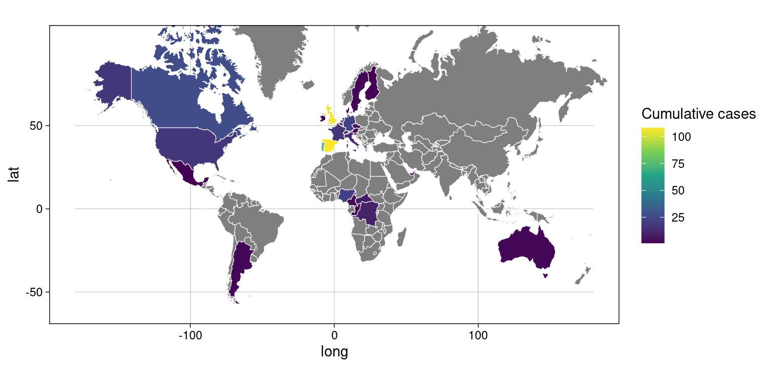
Figure 2: World case map on May 29th 2022
# Plot Europe case map as of July 29th 2022:
plot_case_map("2022-07-29", c(-22, 38), c(35, 64))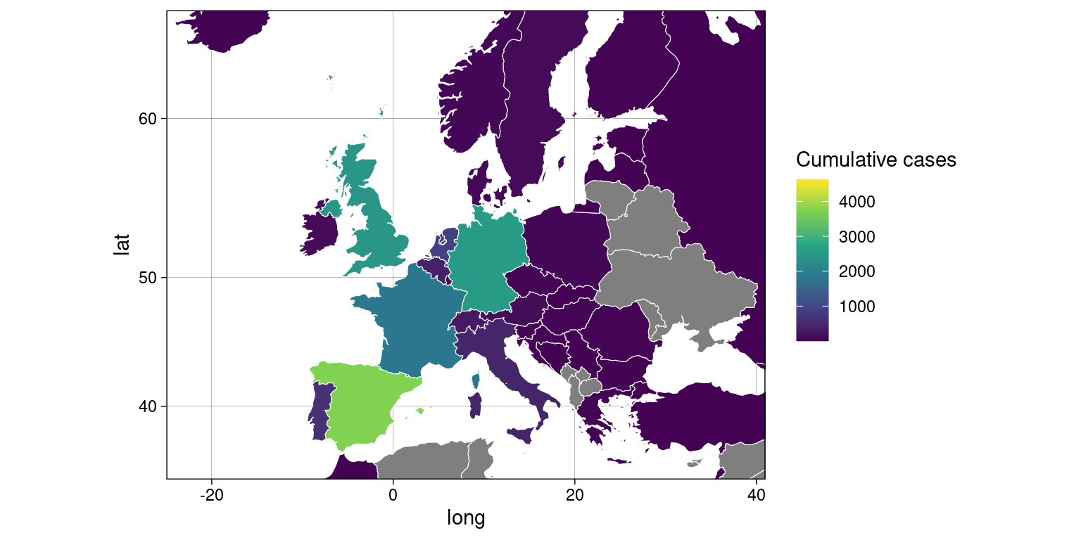
Figure 3: Europe case map on July 29th 2022
# Plot Europe case map as of May 29th 2022:
plot_case_map("2022-05-29", c(-22, 38), c(35, 64))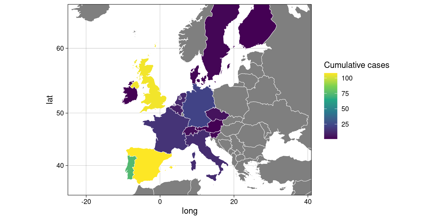
Figure 4: Europe case map on May 29th 2022
A similar map of the latest cumulative monkeypox case numbers in the US can be plotted based on information published and updated regularly by the CDC. The data can be accessed via the “Download Data (CSV)” button at the bottom of the page.
# Download US case data
us_case_map <- read.table("~/Downloads/Monkeypox and Orthopoxvirus Cases in the U.S..csv", header = T, sep = ",")
head(us_case_map)
## State Cases Range
## 1 Alabama 16 1 to 2
## 2 Alaska 1 1 to 2
## 3 Arizona 50 1 to 2
## 4 Arkansas 4 1 to 2
## 5 California 799 1 to 2
## 6 Colorado 53 1 to 2This file contains the latest case numbers for each US state. We can now generate a choropleth map based on this CDC data:
# Pre-process US case and map data
us_map <- map_data("state")
us_case_map <- us_case_map[-which(us_case_map$State %in% c("Alaska", "Hawaii", "Puerto Rico", "Non-US Resident")), -3]
colnames(us_case_map)[1] <- "region"
us_case_map$region <- tolower(us_case_map$region)
if (length(setdiff(us_map$region, us_case_map$region)) > 0) {
  us_case_map_other <- as.data.frame(cbind(setdiff(us_map$region, us_case_map$region), NA))
  colnames(us_case_map_other) <- c("region", "Cases")
  us_case_map <- rbind(us_case_map, us_case_map_other)
}
us_case_map$Cases <- as.numeric(us_case_map$Cases)
us_case_map <- left_join(us_case_map, us_map, by = "region")

# Plot US case map
ggplot(us_case_map, aes(long, lat, group = group)) +
  geom_polygon(aes(fill = Cases), color = "white", size = 0.2) +
  scale_fill_viridis_c() +
  theme_linedraw() +
  theme(legend.position = "right") +
  labs(fill = "Total cases") +
  theme(legend.direction = "vertical")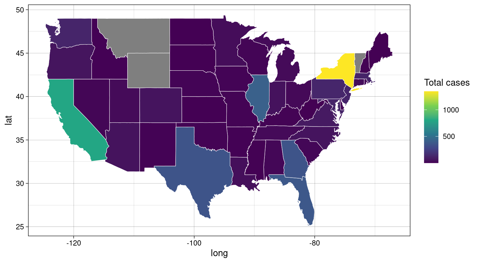
Figure 5: US case map on July 29th 2022
We can also graph case trends over time for individual countries based on the published Global.health Monkeypox repository data. Let’s define a function that takes a country name as input and plots:
- dates on the x-axis
- cumulative case counts on the left y-axis in red
- daily case counts on the right y-axis in blue
plot_case_series <- function(country) {
  # Plot cumulative case counts in red
  country_series <- case_series[which(case_series$Country == country), ]
  par(oma = c(1, 1, 1, 3))
  plot(country_series$Cumulative_cases, type = "l", xaxt = "n", xlab = NA, main = paste(country, "reported case time series"), ylab = "Cumulative cases", col.lab = "red", col = "red")
  axis(1, at = 1:nrow(country_series), labels = country_series$Date, las = 2, gap.axis = 1, cex.axis = 0.8)

  # Plot daily case counts in blue
  par(new = TRUE)
  plot(country_series$Cases, type = "l", axes = FALSE, xlab = NA, ylab = NA, col = "blue")
  axis(4, at = pretty(range(country_series$Cases)))
  mtext("Cases", side = 4, line = 3, col = "blue")
  grid()
}
We can now use this function to explore case trends for multiple countries:
plot_case_series("Canada")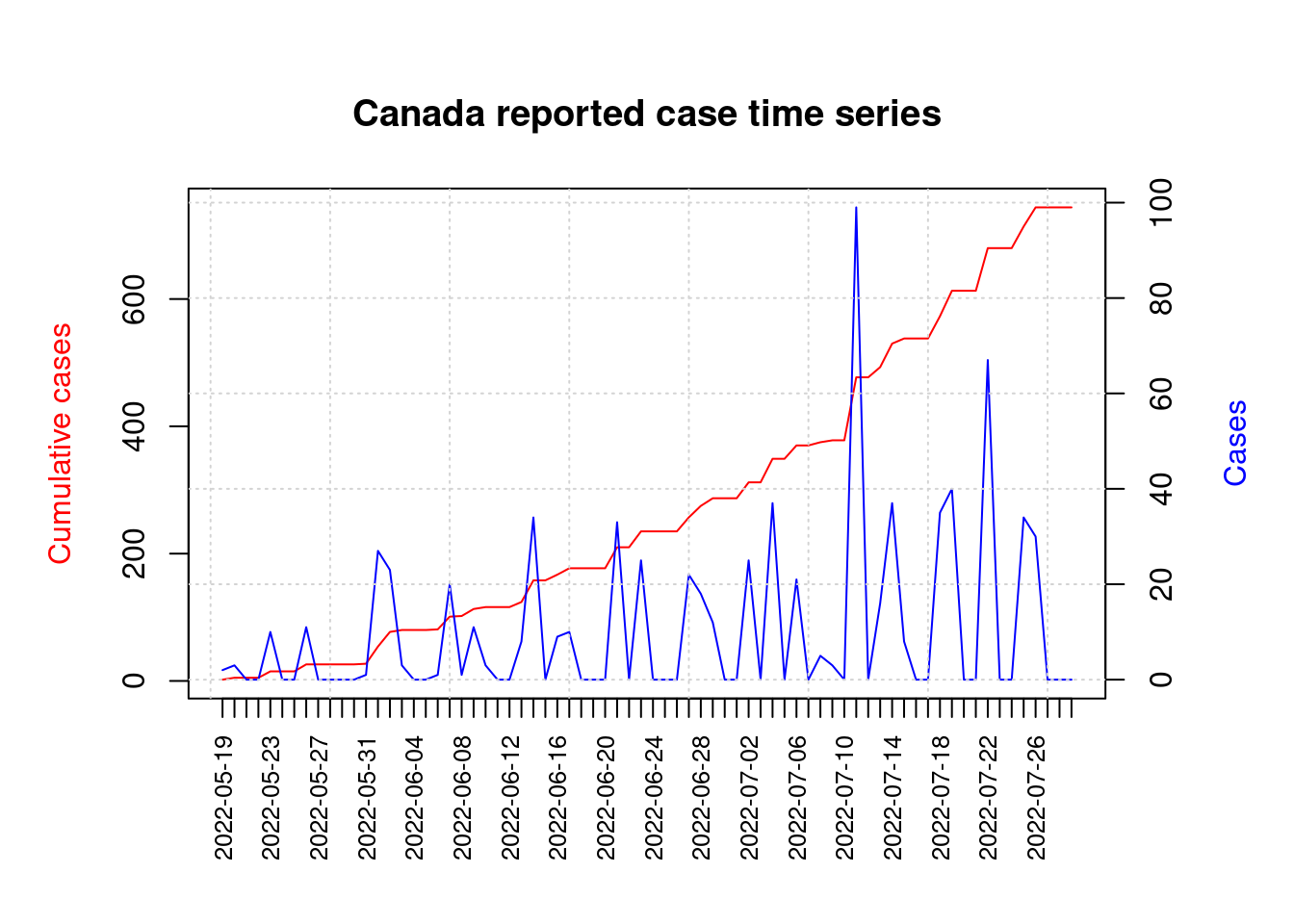
plot_case_series("United States")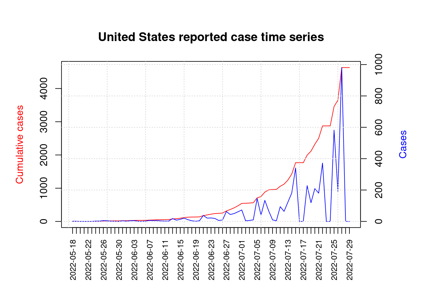
plot_case_series("United Kingdom")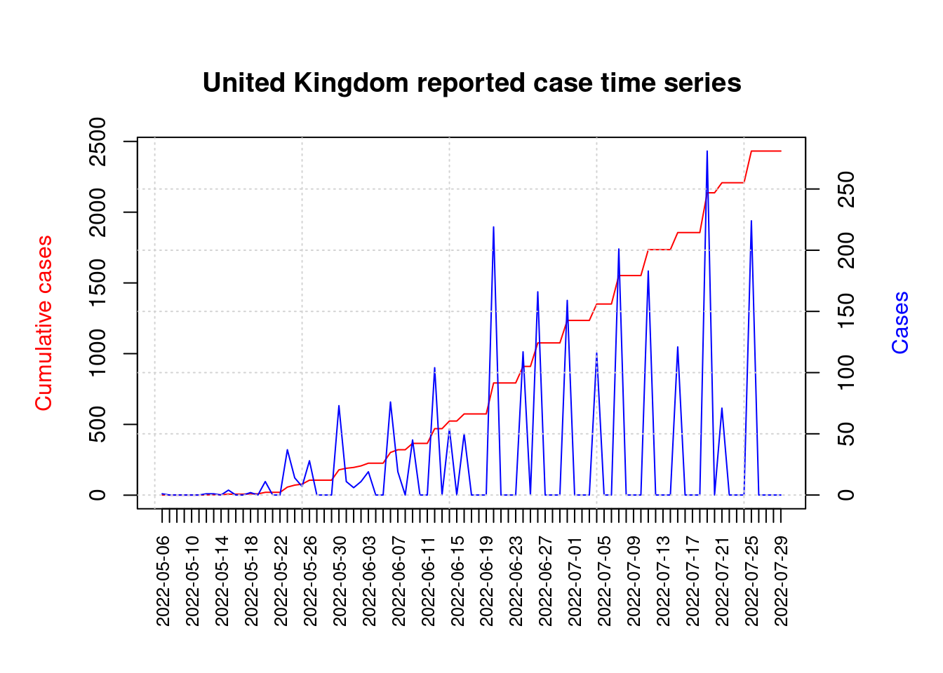
This was a short overview of a few high-quality public databases that aggregate and curate monkeypox case numbers, and we explored some of the options offered by R for custom analyses and visualizations of this raw data.
For a full collection of R programming tutorials and exercises visit my website at codeRtime.org and the codeRtime YouTube channel.